2.3 Plotting Data
2.3.1 Bar Plots
Lets make a bar plot of the ages of the pups of this dataset,
barplot(table(pupage))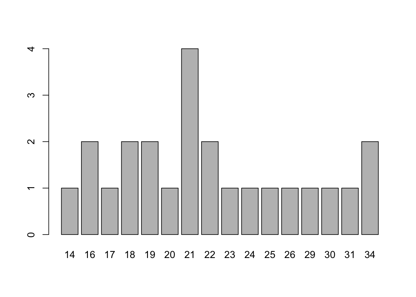
Note, we can add labels and colors with a few extra arguments
barplot(table(pupage), main = "White shark pup age distribution",
        xlab = "Age", ylab = "Number of pups", col="navyblue")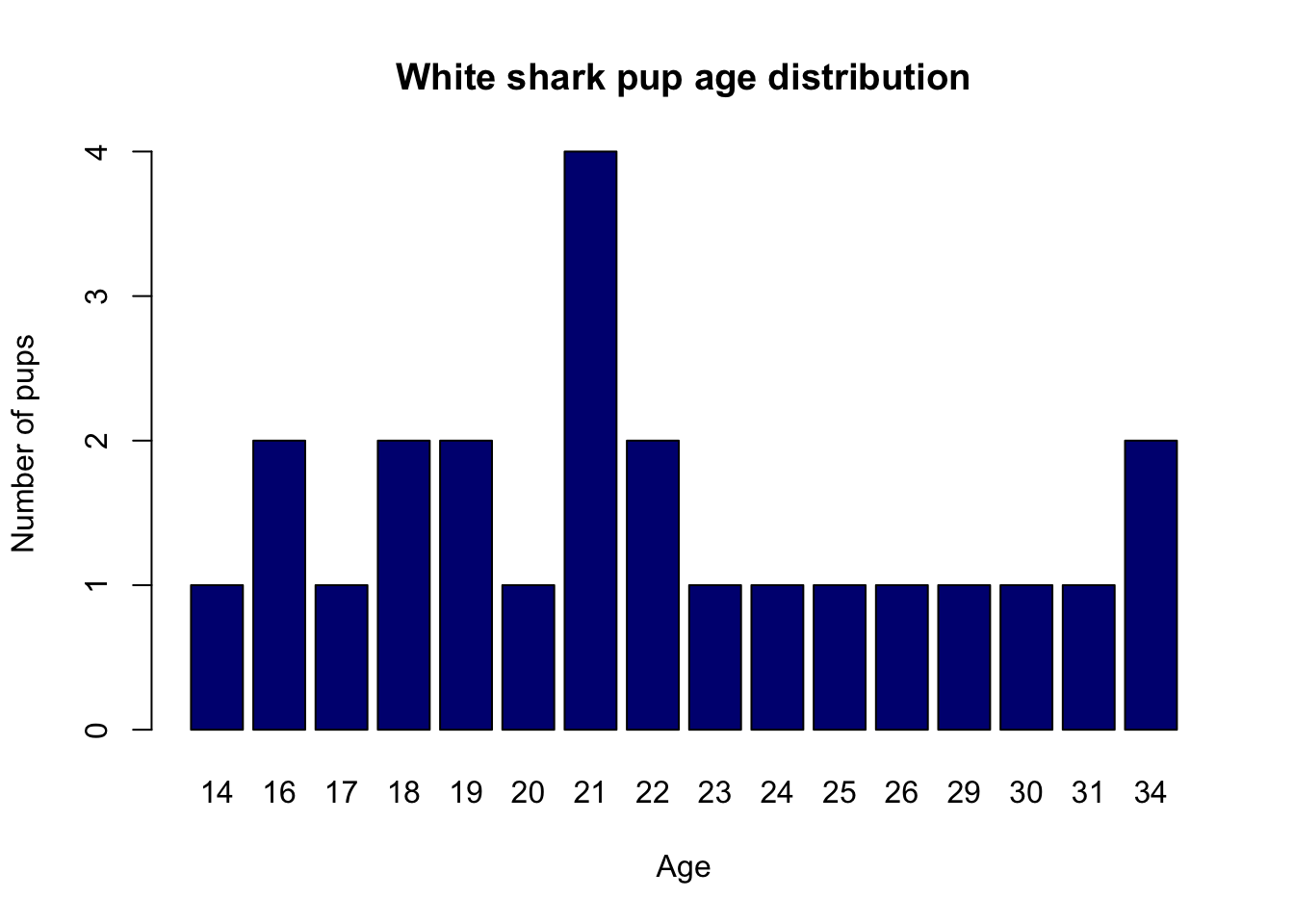
2.3.2 Histograms
Another way to illustrate these data is with a histogram. The following commands make a frequency and density histogram, respectively (and plot them next to each other):
par(mfrow=c(1,2))
hist(pupage, col = "gray", main = "Frequency")
hist(pupage, col = "gray", freq = FALSE, main = "Density")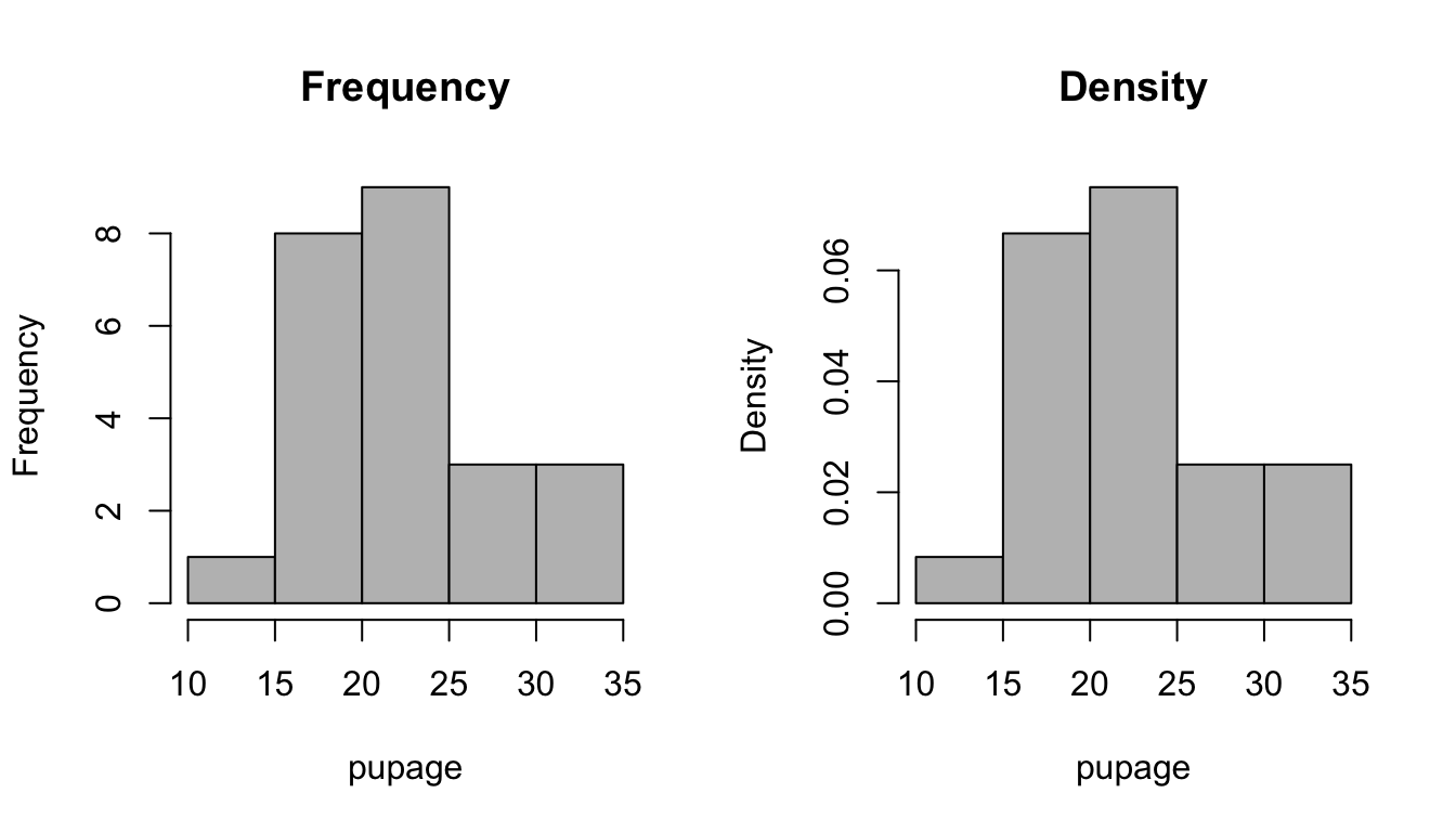
They are obviously very similar to each other, except for one very important difference. On the density plot, the y-axis is scaled so all of the bars will add up to 1.0.
Note also, that this histogram looks different than the bar plot in a few key ways. The bar plot will always have a bar for each element of the table. The histogram works on continuous data as well, creating “bins” of a convenient size for the plot.
2.3.3 Box Plots
Finally, we can look at the how the data is spread out via a box plot, also known as a box and whisker plot.
boxplot(pupage, main = "White shark pup age distribution")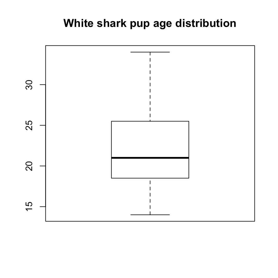
The middle line is the median or 50th percentile. The ends of the box are the 25th and 75th percentiles. The whiskers extend to the extremes of the data, unless the extreme data points are too far out, in which case they are individually plotted as potential outliers.