Example Dataset: U.S. Democratic Votes by State
We’ll look at the trends over recent elections, using a dataset that records the proportion of Democratic votes by state (courtesy of Wikipedia). To refresh your memory: 2016 (Trump v. Clinton), 2012 (Obama v. Romney), 2008 (Obama v. McCain), and 2004 (Bush v. Kerry). These are titled Y2016, Y2012, Y2008, Y2004 respectively in our data frame.
Download the file or copy the URL here: election04-16.csv. Either save the file to your working directory or paste the URL into the read_csv() function.
election_all <- readr::read_csv("election04-16.csv")
DC <- subset(election_all, State == "Washington DC")
election <- subset(election_all, State != "Washington DC")
head(election)
## # A tibble: 6 × 5
## State Y2016 Y2012 Y2008 Y2004
## <chr> <dbl> <dbl> <dbl> <dbl>
## 1 Alabama 0.34 0.38 0.39 0.37
## 2 Alaska 0.37 0.41 0.38 0.36
## 3 Arizona 0.45 0.44 0.45 0.44
## 4 Arkansas 0.34 0.37 0.39 0.45
## 5 California 0.61 0.60 0.61 0.54
## 6 Colorado 0.48 0.51 0.54 0.47Let’s take a quick look at our data, using a kernel density plot to show the univariate distributions of the Democratic voting fraction across states in the 4 elections.
DescTools::PlotMultiDens(election[,2:5],
                         xlab="Statewide % of votes for Democratic Candidate",
                         main="Democratic Vote Share Distributions: 2004 - 2016")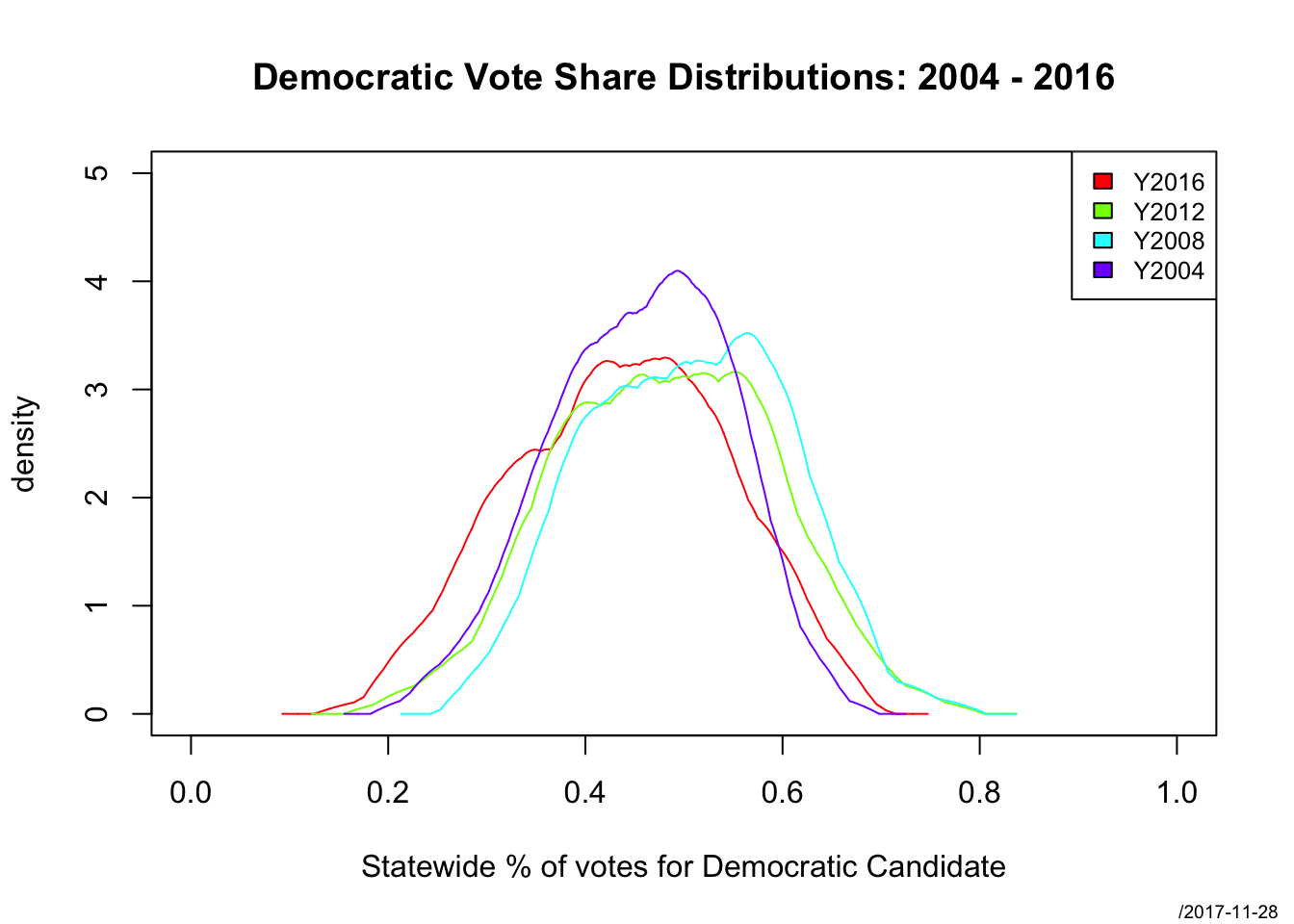
To compare how states changed across years (a bivariate metric), we can use a scatterplot matrix.
GGally::ggpairs(election, columns=2:5,
                title="Proportion of Democratic Votes by State")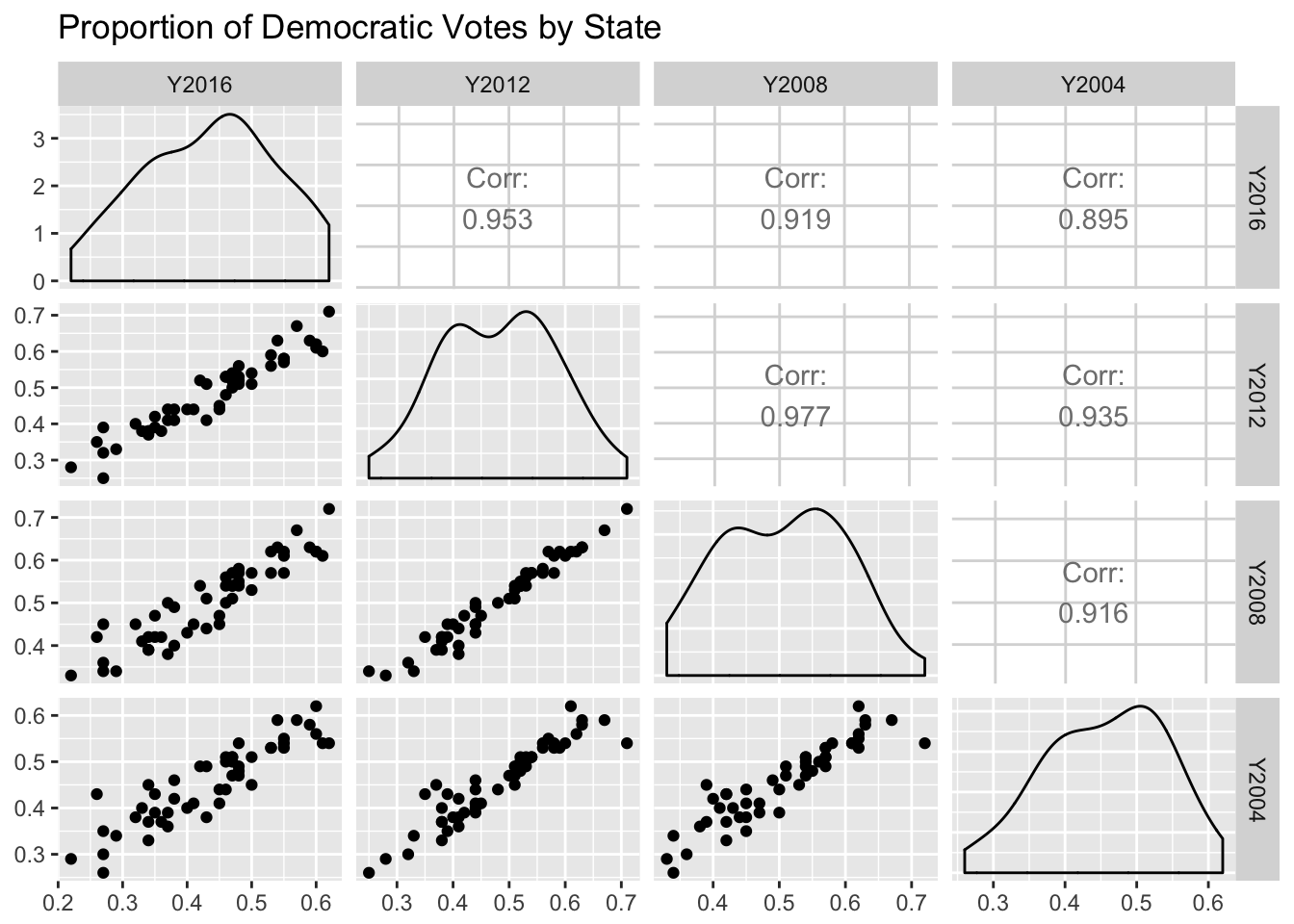
Discussion
- What can we see from the univariate distributions?
- How does the univariate distribution change over time? Is there evidence of polarization in the statewide voting patterns?
- Now viewing the joint distribution, does the pattern change much across the years? Note in particular 2008,2012 compared to the other pairs – does this make sense?
- Also, be sure to note the x and y axis limits – are these the same for all the plots? Does that make it easier or harder to compare them?