3.1 Bivariate Plots
3.1.1 Box Plots
The code to make box plots for two variables is very straightforward, and it introduces us to an important syntax in R. And that is: response ~ covariate. The ~ operator tells R that whatever is to the left is the response, or dependent variable, and whatever is to the right is the covariate or independent variable.
Let us load the pups.csv dataset we used before, and then view the first few lines of the dataset.
pups <- readr::read_csv("https://mdkarcher.github.io/StatLabs/pups.csv")head(pups)## # A tibble: 6 × 5
## id weight length age clutch
## <int> <dbl> <dbl> <int> <int>
## 1 1 20.3 97 14 1
## 2 2 28.0 104 16 2
## 3 3 31.5 106 16 3
## 4 4 31.5 108 17 1
## 5 5 32.5 109 18 2
## 6 6 33.5 110 18 3The clutch variable is a categorical variable noting the birth group, or clutch, of the pup. Bivariate box plots require that the independent variable be categorical, so let us make a plot of weight versus clutch.
boxplot(pups$weight ~ pups$clutch,
        main = "Default Plot", xlab = "Birth group/Clutch", ylab = "Weight")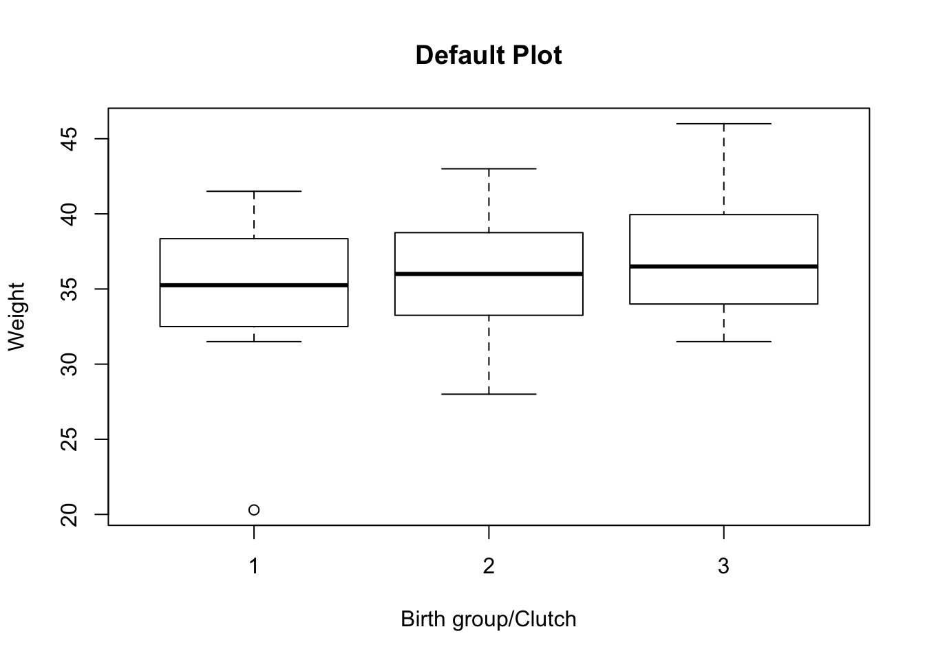
Note that there is a large range for the weight variable, due in part to the outlier in the first clutch, but that otherwise the weight distributions look fairly similar across birth groups.
3.1.2 Scatter Plots
What do we do if we want to plot the association of two continuous variables? This is a very important task in statistics, so it uses the aptly named plot() function.
In the pups dataset, let us consider weight the response and age the covariate. To save on typing, let’s assign the data to shorter names,
weight <- pups$weight
age <- pups$age
Now let’s make the bivariate scatter plot,
plot(weight ~ age,
     main = "Pup Weight vs. Age", xlab = "Age", ylab = "Weight",
     pch = 16, col = rgb(0, 0, 1, 0.6))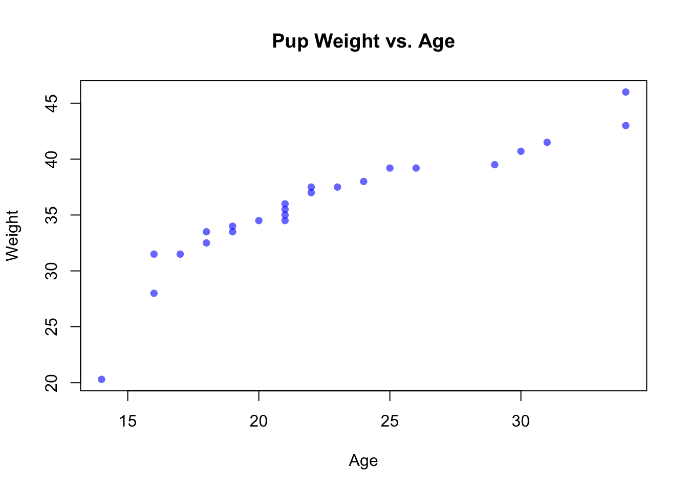
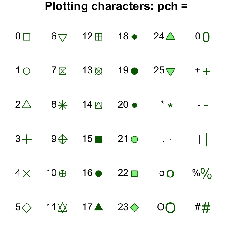
It is important to make the plot explain itself to its audience as much as possible. You should always include a main title, as well as a clear and informative x-axis label (xlab) and y-axis label (ylab). Points may be colored with col. R accepts many named colors (like "blue", and others–Google “R colors” for more), as well as user-defined colors using the rgb() function. The shape of the points themselves can be defined using pch, with some of the most popular listed below.